Data Science
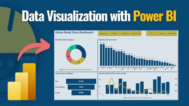
Data Visualization with Power BI
Course Description
Master the art of storytelling through data with our Data Visualization with Power BI course. This program is designed to equip you with the skills to transform raw, complex data into stunning, interactive dashboards that drive strategic decision-making in any organization.
You'll learn to use Microsoft's industry-leading BI tool to connect to various data sources, clean and model data using Power Query, and create sophisticated calculations with DAX (Data Analysis Expressions). We focus on building intuitive visualizations that highlight key performance indicators (KPIs) and business insights effectively.
Everything in this course is hands-on. You will work on real-world business scenarios, building dashboards for sales, marketing, finance, and human resources, ensuring you have a diverse portfolio to showcase to potential employers.
Whether you're a business analyst, manager, or aspiring data professional, this course provides the practical expertise to become a Power BI expert in the modern corporate world.
What you’ll learn
- Getting Started with Power BI Desktop & Service
- Connecting to Multiple Data Sources (Excel, SQL, Cloud)
- Data Transformation with Power Query Editor
- Data Modeling & Building Relationships
- DAX Fundamentals: Measures & Calculated Columns
- Advanced DAX: Time Intelligence & Filter Context
- Creating Interactive Charts, Maps & Tables
- Designing Professional & User-Friendly Dashboards
- Publishing and Sharing Reports Online
- Real-time Data Monitoring & Security Settings
By the end of this course, you will be able to build comprehensive BI solutions that help businesses make data-driven decisions with confidence.
Frequently Asked Questions
Visualize Success
- Duration 2 - 3 Months
- Level Beginner to Advanced
- Certificate Yes